Story
-
Timing |
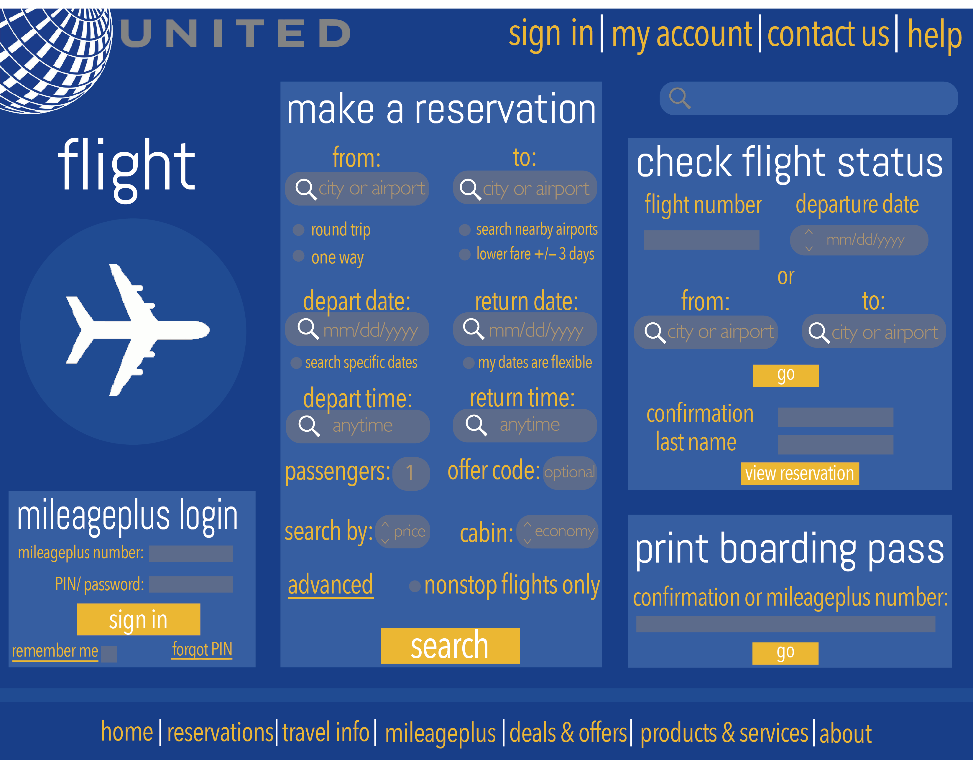
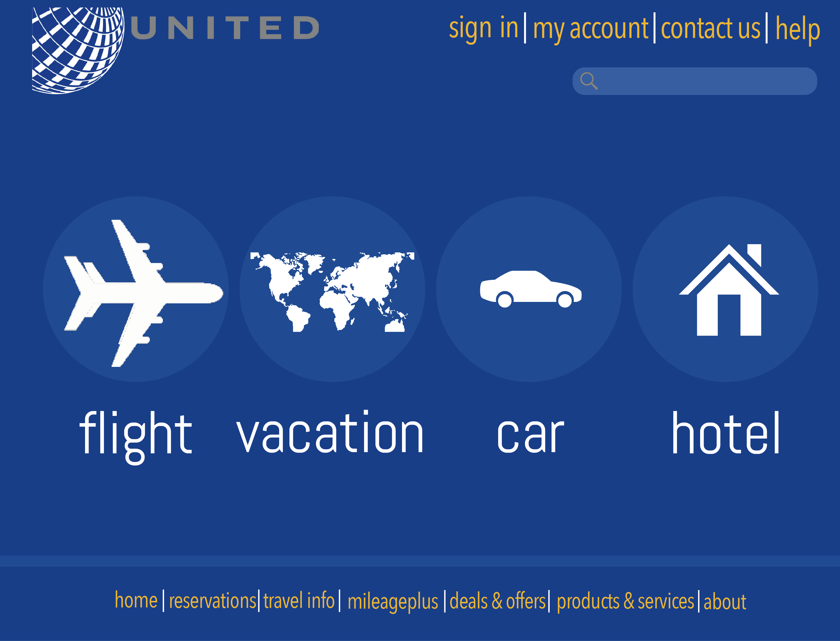
In 2015, I attempted my first redesign of an existing product. As a United customer, I hated using the webiste.
Technology | United provides so many services and products (which isn’t a bad thing per se) that it’s very difficult to piece it together in a cohesive unit that is both functioning and aesthetically pleasing.
Simplicity | I tried to take out the places where advertising over saturated the web page (there are so many places!). I wanted to focus on the core functionality of the site, which is booking a flight
Pics |
